
Chronicle Headlines Logo
From August 2019 - May 2020, I worked as a graphic designer at The Columbia Chronicle, Columbia College Chicago’s student newspaper, and in January of 2020, I was asked to redo the logo of the newspaper’s podcast: Chronicle Headlines. The past one felt outdated and not as memorable as the staff wanted it.

The old Chronicle Headlines logo. The main issue was the white background, which made it float too much on their website.
Research
Along with inspiration from other podcast covers, I researched many symbols that signify podcasts, primarily podcast equipment like headphones and microphones.

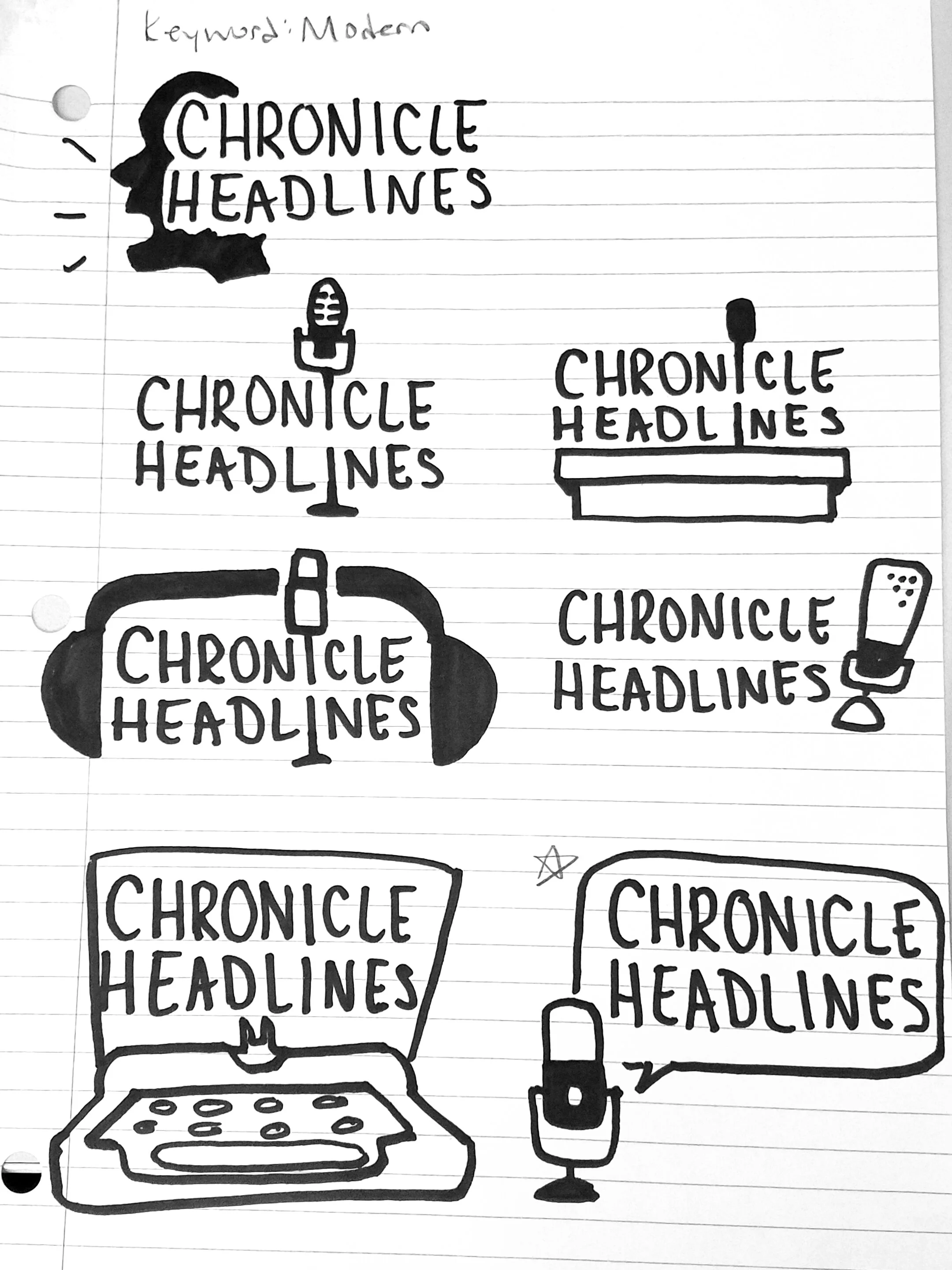
Sketches
For my sketches, I focused on the keyword modern as it was the main focus of the redesign, and I still wanted viewers to get that this is a podcast. Incorporating ideas from my research, I mainly focused on different microphones because I wanted the rebrand to maintain some sort of connection with the past logo as it has been in use for a long time, and could be too jarring for listeners if removed. From here, the management team chose the bottom right sketch.
Roughs
Afterwards, I began the long process of back and forth with the management team. I pushed the sketch they chose and created some variations of the final look by playing with the microphone size, the weight of the speech bubble, or even removing the bubble all together. I chose the type Helvetica Neue because it’s a headline font the newspaper uses, hence the name, and they ended up choosing the version without the speech bubble.

Color
After choosing the logo itself, it was time to play with the color– the old logo’s colors didn’t feel memorable to the staff, and the white background made the logo float in the website. First, I chose different variations of colors that could be used for the logo itself, keeping modern in mind.
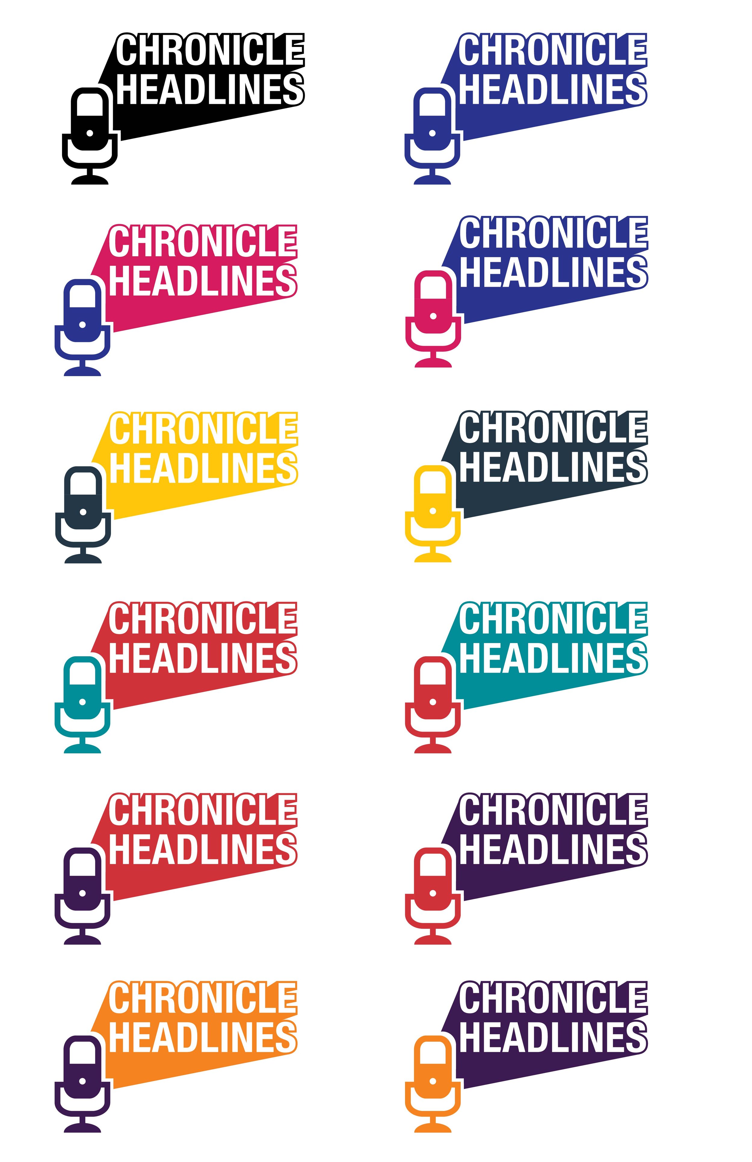

From here, the team decided to move forward with the maroon and blue color scheme (2nd page, row 3 column 2) and the color scheme evolved from there as we played with the background as well, and ended up on a monochromatic blue color scheme. As for the background, I played with 2 designs, one with triangles (a polygonal approach that represents turning the page of the newspaper), and a design with headphones as it was scrapped in the sketching phase. The team ended up choosing the headphone background as it tied to the microphone.


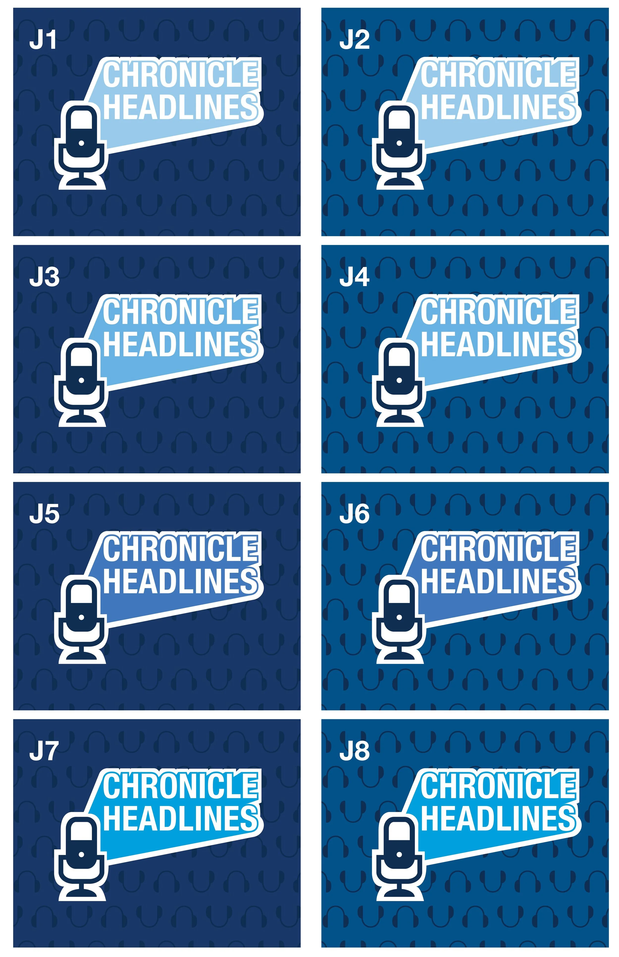

Which brings us to this:
Design J5 was the chosen as the final design.


